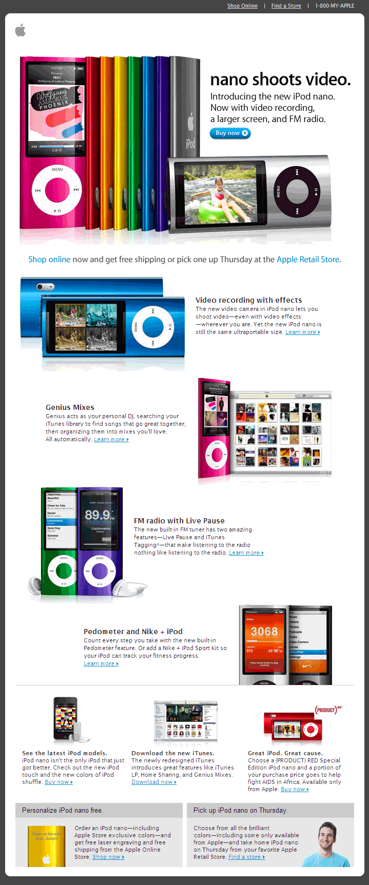
Brilliant Email Design: Apple’s New iPod Nano
Of course you’d expect tight, clean design from Apple but this most recent email for their new iPod nano, from a pure impact perspective, is impeccable.
Sure, the color is brilliant but notice the traditional catalog design technique which uses white space and a downward zig-zag flow of images and content to effectively ping-pong your gaze through the prioritized and concise product features, then on to their related offerings. This design technique although visually appealing is not often found in email marketing messages but it effectively directs the subscriber to read, or in Apple’s case view/read, on. (BTW: There’s more below this ridiculously large image.)
From: Apple
Subject Line: Introducing the new iPod nano. Now with video recording.
It’s important to note however that this email is not 100% perfection — because of the visually-rich nature of the email and the Apple brand — the beauty of the message was suppressed until I downloaded the images. However they did a good job of keeping the pre-downloaded image height to a minimum allowing me to see many of the product features before I let the imagery fly. The preview text too was a bit clunky, it read: “Shop Online | Find a Store | 1-800-MY-APPLE” but with the long subject line it was somewhat truncated. In any case I don’t think most readers would complain, it is Apple new shiny toy. Good Stuff.
- 5 Alternative Email Calls-to-Action - February 7, 2023
- Ignoring Usability When Selecting an Email Service Provider is a Giant Waste of Money - May 17, 2022
- Email Marketing: Master Basics Before Bodacious, Please! - April 21, 2020

