What can You Learn from this B2B Email Campaign?
Let me first say, I love Bluehost. I really do. I’ve used and recommended them for years, they’re an excellent hosting company; however their email marketing is a different story. That said, I’d like to quickly analyze one of their most recent email campaigns and see what we can learn from it. Here it is:
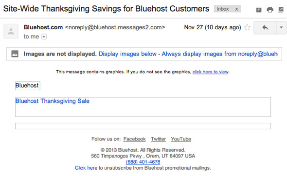

Subject Line
It’s mildly descriptive, not too exciting or compelling but gets the job done. I’d give it a C+. I’d like to see something that pulls in the offer, 50% off is a very strong promotion, so why not feature it in the subject? If this offer is only for faithful existing customers, point out how it’s exclusive; this offer wasn’t, so saying “for Bluehost Customers” is a little redundant. I’d test subject lines like these:
- 50% off everything. 3 days only.
- Evan, thanks for being a great customer.
- Wow, here’s one more thing to be thankful for.
From Name
Bluehost.com – This is fine, descriptive I know who this email is from, a company like Bluehost doesn’t have a whole lot of leeway in the from name. Though I’d certainly test some minor variations such as: Bluehost or BlueHost (sans the .com). Smaller companies can try using a particular person’s name, lot’s of folks respond better to “Frederick Cumberpatch” than “Faceless Company.”
Reply To Email
This is bad on multiple accounts, D-. First is the noreply email address. Bluehost is known for their stellar support and customer service, why ruin that image with a noreply email address? Email is a two way street, and a monitored reply to email address is a great way to get free customer feedback. How many people do you really expect to hit reply anyway? The answer? Almost nobody ever hits reply, even when that action is specifically requested. Finally, the domain has “.message2.com” at the end, this could make someone think it’s some sort of phishing scam. Guys, make it hello@bluehost.com and don’t look back.
Pre-header
Bad, D-. would have almost been better to not put anything. The preheader’s main job is to act as a continuation of the subject line (and can also feature housekeeping things like an archive or forward link). Put something useful here and you can increase your open rate by a pretty good chunk. For instance: “Save big bucks on blah, blah, blah…”
Email Design
As a designer, this is the most disappointing to me. It’s overwhelmingly mediocre. The biggest negative is it is almost entirely image based, which isn’t necessarily a bad thing, but if you’re bold enough to go completely image based it should at least look rad, not boring like this. The offer is entirely obscured through default image blocking, there is no way to decipher it unless images are on. At least add some interesting or relevant alt text to those images and give me a clue as to why I should show the images.
Beyond that, even with images on the ultra light typeface is difficult to read, various alignments are off and the branding is just so very generic (I could swap in just about any corporate logo and no one would know).
One bright spot in the design is the black subsection, a sneaky little secret offer… Yes, I actually logged in 2 days later to see what the “unbelievable offer!” was. Sadly, I couldn’t find anything about the secret offer when I logged in. I still don’t know what it was (Bluehost, shoot me an email and let me know what is was will you? I’m still kind of curious.)
The email also wasn’t mobile responsive. Which is sad because it isn’t too difficult to do these days, and the returns can be huge.
Mailing Frequency
It could stand to go up. I believe I get promo emails from Bluehost roughly once or twice a year. I’d like to see this go up to at least every other month, and preferably every month. It doesn’t always have to be discounts either, new products, features, tips, tricks etc. all make for great content. It’ll help your customers out and make you more money as well. Win-win.
Other Stuff
It’s missing a forward function. Sure, it may not be used a lot but the folks who do it appreciate it. No permission reminder. Something as basic as “You’re receiving this because you are a customer etc etc.” can help cut down on spam complaints. Alternatively, something with a bit more personality can help build a better connection with your customers “We here at Bluehost love our customers (ie: you) and we want you to save tons of money.”
The unsubscribe line could have a bit more personality too (“Don’t want to save a bunch of money? Unsubscribe here.”), or give the option to change preferences rather than a blanket unsub. Social links may be better served as sharing links instead. You could even incentivize sharing, (Share this and get an extra X% off!).
Conclusions
As much as I picked on this email, it is far from the worst I’ve ever seen. The offer is very strong, the company is great and to their credit they have made great strides forward in the past year or two. With some very easy to make tweaks I can see Bluehost’s email marketing results really improve this coming year.
I for one, am looking forward to it :)

- Virgin Mobile – What they do right and wrong (mostly wrong). - February 12, 2014
- What can You Learn from this B2B Email Campaign? - December 10, 2013
- What Sears Does Right (and Wrong). - July 30, 2013