Custom Email Templates: A Behind the Scenes Look at the Email Design Process
Designing Custom Email Templates
Here at Indiemark, we design a lot of custom email templates all of which are intended to fit neatly within the boundaries of the client’s brand, render beautifully across devices, as well as ensnare the reader and draw them towards the desired action.
Sometimes we work with fairly conservative brands. So the final product is what you might expect, well, conservative.
But every once in a while we get the chance to flex our creative muscles and push the look, feel, and personality of the email template quite a bit further.
Project Background
Recently KIXEYE, the kickass social gaming company, approached us with the redesign of their newsletter template. They’re a pretty rad group so they wanted their emails to follow suit. For creative sprints like us this is always a welcome opportunity.
But rather than follow an established design process for this project (which includes reviewing the client’s style guide) we broke our own rules and started work on their newsletter template, sans style guide.
This was somewhat intentional, because it’s easier to be creative without restrictions but also because we were anxious to get funky.
Step One: Getting to Know KIXEYE
We learned about KIXEYE’s offerings as well as the demographics, behaviors and attributes of their players and fans. We learned about KIXEYE’s corporate culture and the typical type/volume of content their team will ultimately populate into their email template.
Step Two: Presenting Multiple Concepts
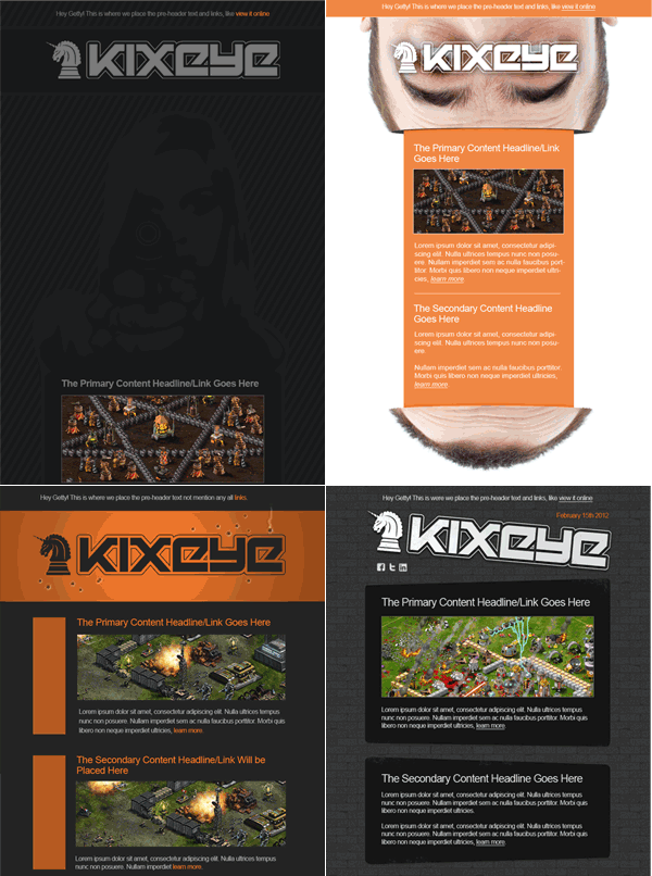
As we often do, we’ll put two or more designers on the early stage mock-ups. This helps to align a particular email designer’s style (and take on the project) with the client’s expectations.
Here are a few of the email designs we came back with initially:
Step Three: Thinning the Herd
Although there were winning elements, none of the designs truly tickled the client’s fancy. We then brainstormed internally and pitched a couple of concepts to KIXEYE.
Once the concept was approved, we presented a single, focused design:
Step Four: Refining the Design
The client loved it. But they did ask that we ‘harden it up’ a bit.
Keep in mind, that the plan all along was to animate the email, in this case we would make the animals blink/move, the liquor bottle drip, and flicker the flames of Hell. (In case you didn’t already know, we really love email animations.)
Step Five: Taking a New Direction?
Because we didn’t wait on the, now finalized, style guide we were ready to present another variation which used the proper color scheme.
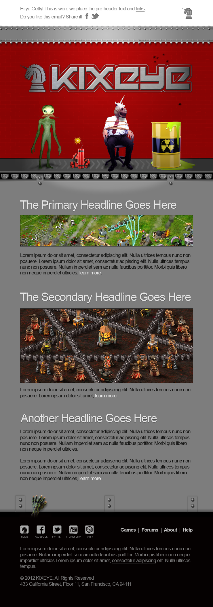
But upper-management at KIXEYE had second-thoughts about using cartoon-style imagery. Unknown to all of us, one of their competitors uses a similar style, so we came back with this:
Step Six: Animating, Coding and Testing
They really, really loved it now. So did we! The personality was completely on point.
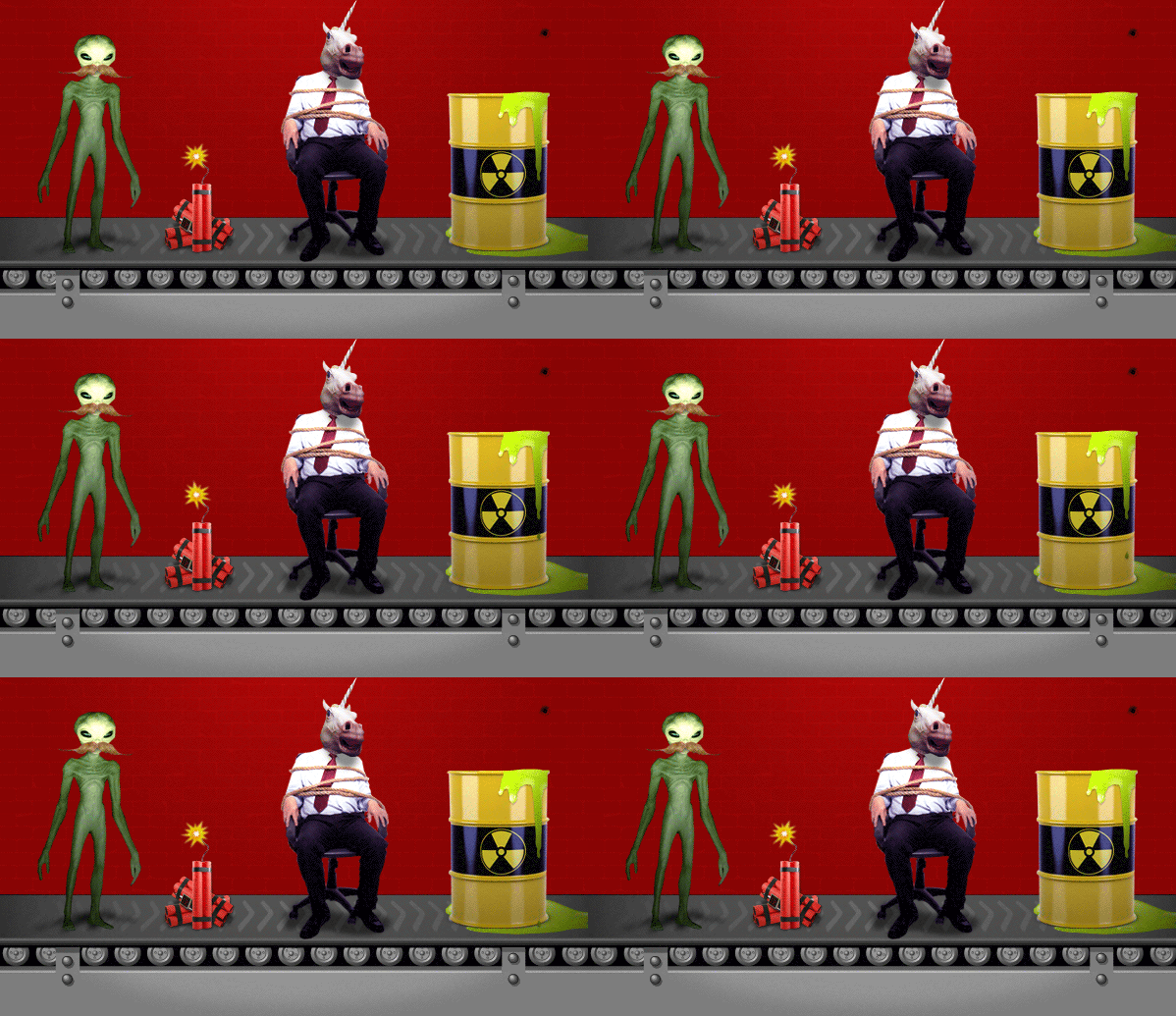
We were now locked and loaded so we created the email animations:
(Can you find all four animated elements?)
We then proceeded to code the email, load it into their Email Service Provider and then test for proper rendering and functionality.
I’m happy to report that that the final product was bullet-proof, on-brand, and easy to publish.
And that, my friends, is the true story of how we designed one custom email template.
- 5 Alternative Email Calls-to-Action - February 7, 2023
- Ignoring Usability When Selecting an Email Service Provider is a Giant Waste of Money - May 17, 2022
- Email Marketing: Master Basics Before Bodacious, Please! - April 21, 2020


5 Comments
by Rene
wow, amazing work! I liked the rainbow-sinkhole-eyepath-thingy best. (ps: the animated wheel was a lil difficult to spot. ;> ..)
by Scott Hardigree
Thanks Rene! I favored the rainbow concept too (shh). BTW, good eye.
by Jen Capstraw
Nice work!
Curious about how it will look with images off and also on mobile devices.
by Scott Hardigree
Hi Jen! It renders very well in mobile environments, iPhone in particular. As it was built on a 640 px grid and the typefaces are at least 14 pt so it scales nicely to a 320 px.
The code uses a neat combo of HTML 5, media quires and new a mosaic technology, which not only maximizes layout and styles, based on device, but it also displays what look to be a pixelated version of the image, but it’s actually html cells. Thanks for the kudos.
by Jen Capstraw
Now I like it even better! Bravo!