Email Design Best Practices in 2013 (Infographic)
Ravi from Email Monks sends their updated email design best practices infographic, which comprises useful information on how well one could and should design an email or newsletter templates in 2013.
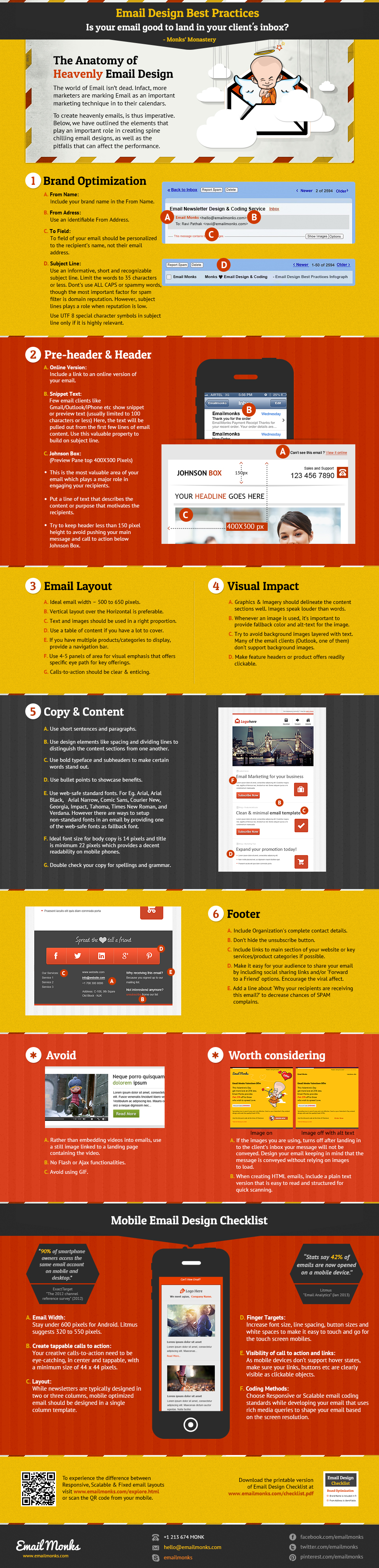
The main topics covered within this email design best practices infographic include current mobile rendering considerations as other important factors to consider, such as the pre-header, body content and footer.
Latest posts by Scott Hardigree (see all)
- 5 Alternative Email Calls-to-Action - February 7, 2023
- Ignoring Usability When Selecting an Email Service Provider is a Giant Waste of Money - May 17, 2022
- Email Marketing: Master Basics Before Bodacious, Please! - April 21, 2020
5 Comments
by Brandon
I hate to be that guy, but you have a typo on the infographic in the Brand Optimization. Letter B – Email Address, ‘address’ is missing a d.
by Scott Hardigree
Thanks Brandon. I’ll be sure to let the Email Monks folks know.
by Aimee
Hi there,
Any thoughts on emails that have lists at the top that take you to areas of the email? (anchor links)
Thanks
Aimee
by Anonymous
Not to come off as a troll, but you mis-spelled Address in the 1b) title.
by Joe Hirst
Great infographic!
I see a large part of the industry neglecting mobile optimized emails. Not everyone has an iphone, for WebKit, standard email design practice can work. However, android and other mobile OS mail apps have problems with displaying how the designer had intended it to be.
It’s great to see you bring up the importance of this in the infographic.