Does This Retail Email Hit the Right Chords?
I recently received an animated email from Guitar Center. But rather than tackle this email critique single-handedly, I asked a few of my friends to chime in.
First you’ll see the campaign details as well as screen captures of the creative, then you’ll find the critiques. Finally, did we miss anything? Please share your thoughts in the comments section below.
Guitar Center Email Critique
Subject Line: Private Email Coupon
Friendly From: Guitar Center
Received: Tuesday, January 24th at 5:07am EST
Inbox Preview (Gmail):
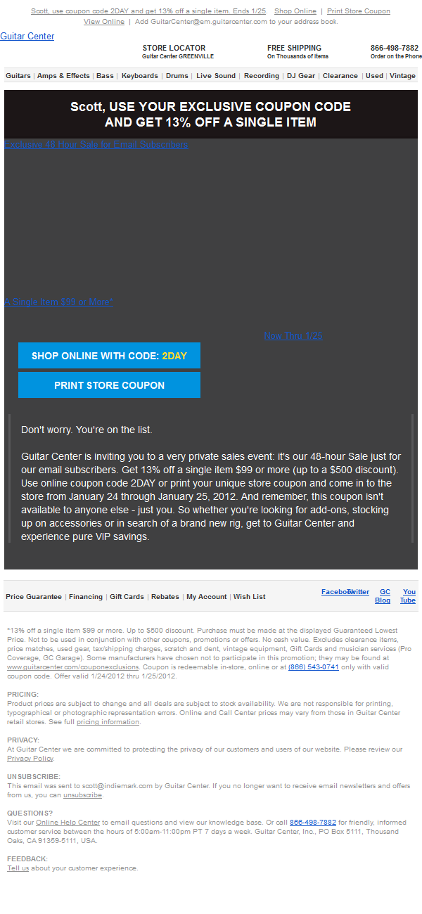
With “Images Off”:
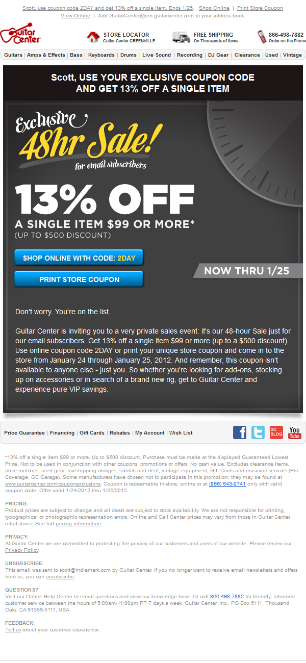
With “Images On”:
The Animation:
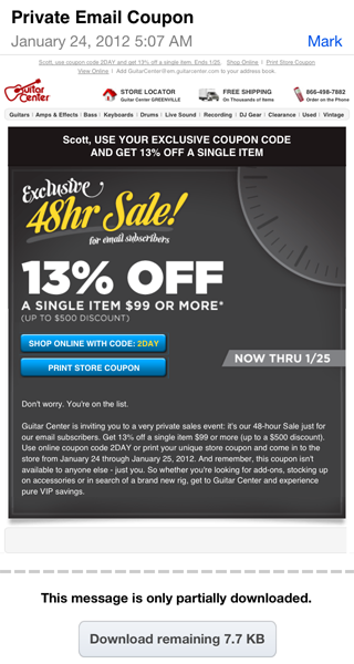
Mobile View (iPhone):
Tim Watson, Founder at Zettasphere (@tawatson)
Subject line – I find the subject line is too short, it doesn’t give me enough information about value, too non-specific. I like the use of private as opposed to the often used exclusive word. Do people really believe exclusive anymore? However body copy is inconsistent and switches back and forth between exclusive and private. Should be more consistent message.
Pre-header – Good to see use is made of the pre-header. It starts by talking about the coupon code before talking about the offer and urgency. I don’t need the coupon code until I’m hooked on the deal. The messaging order is wrong. Is whitelisting request really the best use of pre-header space. Time to re-think this?
Clock graphic? – This is weak and doesn’t add to the messaging. If its supposed to give time urgency it should be much clearer, may be a calendar highlighting the next two days.
Design overall – Its way too busy with too many angles, fonts and styles. I simply didn’t know where I was supposed to look at first.
Copy paragraph – The paragraph of copy starting “Don’t worry. You’re on the list…” begins well and should be shorter and above the fold, or a least the first couple of lines of it, so its seen with images off and there is something to engage with when no images shown.
Call to action buttons – Good to see use of buttons with high contrast and that work with images off.
Urgency – More should have been made of the urgency factor, including it in the subject line.
Specific single products – Given its 13% off single item over $99 deal then the most popular two or three items that qualify might have been included to whet the appetite. Though I’d split test this as it might serve to distract from getting to the website.
Rendering – Kudos for a design that rendered and translated well on the mobile screen.
Chris Donald, Chief Strategist at Inbox Group (@inboxgroup)
Real-time Content – A perfect example of an email that would benefit from time-based and location-based email content. If the email had a countdown clock letting me know exactly how much time was left on the sale as well as the nearest location to me when I opened the email that would have rocked.
Animation – The current animation although it catches the eye, seems a bit strange.
Personalization – The personalization in the pre-header was probably enough and not needed in the body.
Rich Barrett, Creative Director at Mass Transmit (@richcbarrett)
Design – As far as an email design that works for both mobile and desktop, I think this is a nice looking example. The bold “13% OFF” and the contrast of the “48hr Sale” and the blue buttons on the dark gray background are very effective.
Animation – I was thrown by the back and forth clock animation to the point where I wasn’t sure it was supposed to be a clock and wondered if it was supposed to be a dial on an amp or something? I’m still not sure. Either way, I applaud the subtle use of animation but there was probably a better way to handle it.
Below-the-fold – A lot of the bottom half of the email seems to be an after-thought. The layout of the blue buttons with the “Now Thru 1/25” graphic seems a little unbalanced. The large block of text below it could have used more attention style-wise. And the bent-paper shadow graphic at the bottom is unnecessary and seems at odds with the rigid rectangle it is meant to be cast from.
Samantha Iodice, Email Marketing Manager at Aspen Marketing Services (@e_maven)
Offer – Perhaps the 13% is supposed to be intriguing and fails; but perhaps if it was deployed for a sale on Friday the 13th it would have worked brilliantly.
Buttons – The buttons are great, except I wonder if they’re too close for mobile usage and would suffer fat-finger syndrome? Hard to tell.
Subject Line – I agree that “private” would have been the preferred term, and would add only potentially personalizing the SL “Scott, a private sale – 2 days only” or “Scott, a private sale – act fast!” or some iteration.
Takeaway – What’s so funny to me is that it’s Guitar Center – how easy is it to build excitement with guitars and rock n roll? Big fail.
Evan Diaz, VP of Creative Services at Inbox Group (@evandiaz)
Subject Line – It’s a little bland in my opinion (“email coupon” zzzZZ), but overall it’s saved by the word “Private” I would have used the great line they had in the body of the email as the subject “Don’t worry. You’re on the list” It has the same feeling of exclusivity but it also creates a bit of curiosity.
Offer – 13% Simply great. It feels much more substantial than the typical 10% to the customer, but doesn’t cut margins too much for the retailer; a nice balance.
Hidden Gem – One thing I almost missed the first time I looked at the email was that basically everything in the email is clickable. The buttons are of course, but they also took the time to make sure all the images and headlines were as well, and they even made all of the body text clickable! That’s pretty slick in my book :)
Scott Hardigree, CEO at Indiemark (@indiescott)
Subject Line – Exclusivity meets brevity. I love it. However it could use a a sense of urgency, after all this is a 48-hour sale.
Pre-header – The first name personalization and sense of urgency really stood out in my Gmail inbox lineup.
Header – The first name personalization in the header copy (on the black background) looks and feels unnatural.
Rendering – On or off….who cares?! This email is understandable and actionable, in either state.
Offer – I suppose that the odd discount of 13% is intended to peak my interest but all it does it make my calculations all the more difficult.
Animation – It’s just odd. I assume it’s supposed to be a clock. If so, I feel like I’m traveling back and forth through time, not racing toward a quickly approaching cut-off date.
- 5 Alternative Email Calls-to-Action - February 7, 2023
- Ignoring Usability When Selecting an Email Service Provider is a Giant Waste of Money - May 17, 2022
- Email Marketing: Master Basics Before Bodacious, Please! - April 21, 2020


4 Comments
by Rut Dawson (@rutdawson)
Overall it’s pretty cool and this coming from a bass player. (Yes I can count to 4, keep a beat and make bad drummer jokes…)
You’ve gone through the trouble of adding the clock image (understood time is a ticking on the offer), but could it not have been an actual guitar animation, maybe a nice custom good looking model? You gotta show me some honey and get my musical juices flowing for me to spend some hard cash, offer or not. Maybe a 2 column email with text on left and guitar on right?
That’s a lot of premium space taken up by images at the top of the email that might not be downloaded by the recipient. Though to be fair you’ve got the call to actions covered, very much like that (with “images off”) you’ve got the key facts in the pre-header, the top banner (white on black) and the sale link underneath. All the most important details of this offer are at the very top. You also used text on your buttons rather then just using a button image, smart move.
I would of personalised the “Dont worry..”text and moved it up top.
“Dont worry Russell. You’re on the list” – Straight away this email is for me, I’m part of something special, I don’t wanna miss out and I wanna read on. For once my name’s on the list and I’m getting in…happy days.
by Scott Hardigree
Very nice feedback Russell, especially the personalization of the “You’re on the list” content block.
by Stephanie Fischbach
Scott,
Really enjoyed how you set up this blog post. What better way to analyze than with the help from some great experts. I, too, agree that the subject line could have been more descriptive and detailed. I also personally think that if there had to be an animated graphic, it could be something more musically involved ( maybe a guitar : ) ) and worth “clicking the download pictures for. Thanks for posting!
by Scott Hardigree
Thanks Stephanie!