8 Transactional Email Tips to Make you Stand Out (+ examples)

Your transactional emails are boring! I dare to say that 90% of all transactional emails are forgotten within a minute. But it doesn’t have to be that way. So here are 8 examples and tips to turn generic transactional emails into awesome engagement rockets. They just need a little extra love and care.
Most transactional emails have valuable information your recipient needs to read.
However, many of these emails look the same, boring your recipients. They see, open, and if you’re fortunate, click your email. Of course, emails like password resets will get you clicks, but what about your order confirmations, notifications, or customer feedback emails?
Let’s dive into the tips with transactional email examples that go beyond standard practices and make your emails stand out from the crowd:
- Dare to go wild: use a bold email design;
- Go for Less is (sometimes) more;
- Make sure to add valuable content;
- Create dynamic PDF attachments;
- Promote awesome User Generated Content;
- Throw in a little cross- and upselling;
- Free stuff works! Add referral bonuses;
- Let them get to know you; tell your story.
Research from Experian shows that transactional emails have higher OR, CR, and revenue per email compared to bulk email.
1. Go bold on the design.
Love it or hate it, but one way to make your emails stand out from the crowd is by making it look grotesque. Sure, a standard email layout feels nice and safe, but it’s hard to be remembered since everyone does that.
I admire brands that send emails like it’s their pride and glory. Vivid colors, large vectors or images, 18px + text, stuff that really pops out. Emails that are like a purple cow. Take this notification email from G2:
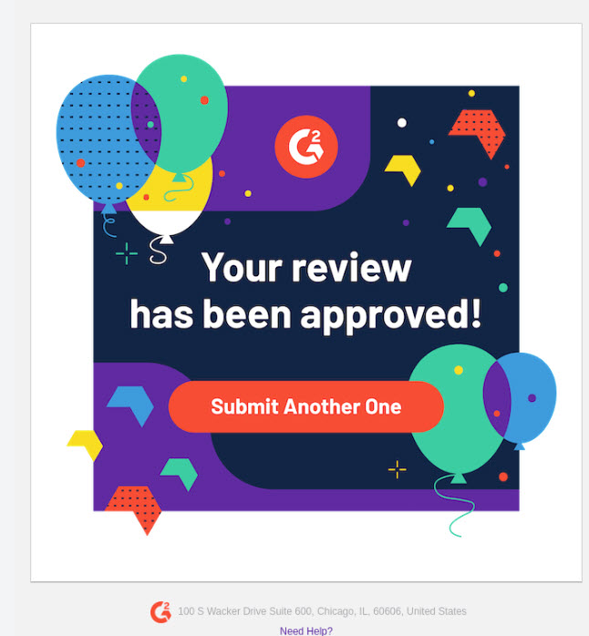
I like how vibrant this email is; it makes me want to submit another review.
It’s no secret that RGE showcases really good emails, so that’s my go-to place for email examples. Once again, I found enough awesomeness to demonstrate my point here. Check out Headspace for example. Let’s dissect the boldness their welcome email:
- Gigantic header image (looks like 600px square);
- 18px main text and 40px header font size (Apercu and Arial);
- Buttons with lots of spacing;
- Large vector art with vibrant colors.

2. Less is (sometimes) more
A ‘trend’ in transactional email marketing is to make emails feel like 1-on-1-communication through minimalist design or even plain-text emails.
Though this type of email design isn’t bold, it can help you create more engagement with the persons you’re sending it to. SaaS companies do it all the time. Their onboarding campaigns are stuffed with emails “from their CEO/CMO/whatever position” to help you accomplish your goals. Here is an example from Zest.is. It sets expectations and has a very personal feel.
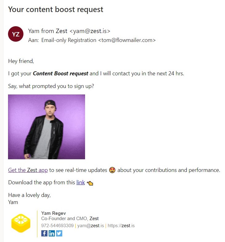
The type of transactional email truly depends on your email strategy and proposition to decide whether you should go all-in on email design or keep it nice and simple.
3. Add valuable content to the message.
Most transactional emails have valuable information you feel your recipient needs to read. Valuable content is a great way to engage recipients with your emails. it can even be content they didn’t know they needed in the first place, but actually do.
You’ve seen onboarding emails saying: “Let’s get you started using this service, click here for step-by-step guides”, or something like that.
The key to relevant content is simple: provide information that your new customer hasn’t read already and could very well find useful. Think of:
- Just bought a pair of shoes? Read our 10 tips on how to keep them clean;
- Going on a trip to Athens, Greece? Check out our favorite places to eat;
This Glenlivet example asks two simple questions to find out what whiskey you (their new subscriber) would probably love most. No “buy now” button, just guidance towards a perfect match:

4. Create dynamic PDF attachments
To be extra valuable to your customers, add PDF attachments to your emails. This allows them to save, print or share your content easily. Dynamic attachments are great for data merging (using data from your CRM and ERP at the same time) or when an attachment needs to be hyper-personalized.
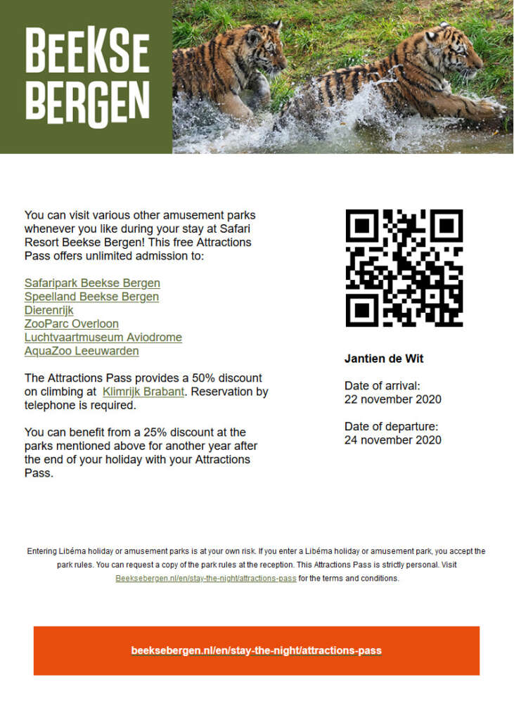
Invoices, entrance tickets, and periodical reports, for example, are great for this.
Dynamic PDF generation looks a bit like this:
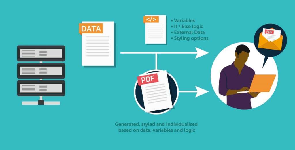
And results in this:
5. User Generated Content
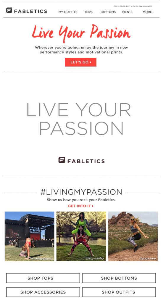
A creative new way of sharing relevant content is through User Generated Content (UGC), like this Fabletics example.
(source: Drift)
UGC showcases how your product is used by peers, justifying your new customers’ choice. The Fabletics example also challenges the recipient to join their #livingmypassion community by sharing their own pictures. UGC is somewhat of a mix between user reviews and product images, showing how cool your brand is.
5. Throw in a little cross-sell & upsell magic
The most effective way to do a Next Best Offer type email is through an email recommendation engine. You often see a “YOU’LL LOVE THESE” section in order confirmations.
Next Best Offers go beyond just content. It enables you to sell more through transactional email. Generally, there are two ways of transactional email sales: cross-sell and upsell.
Cross-selling is the promotion of additional products to the already purchased product or service. In other words, it concerns a product or service that is complementary to an earlier purchase. Think of:
- Just booked a flight? Get $5,- off on a parking spot;
- Did your car just turn five years old? You might be interested in our roadside assistance service.
Be aware, you’ll often see emails stuffed with items that look like the thing you already bought. That can be due to un-optimized recommendations, so it is worth it to test your abandonment and transactional emails, just because a computer made the suggestion doesn’t make it right (per se).
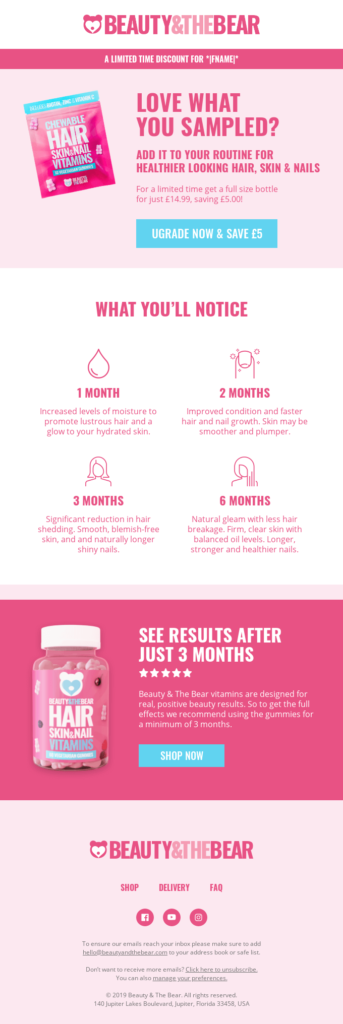
Up-selling on the other hand is about selling an improved version of a product or service. You often see this in Freemium services that offer a free version of their software and then try to sell a paid version to you in different ways. Or, as in this example of Beauty & The Bear, chewable vitamins:
7. Referral Program
Free stuff! … If you tell your friends about us.
One of the most cost-effective (email) marketing strategies involves using your current customers to spread the word about your brand. Referral programs in emails work since your most loyal customers are likely to be on your email list and loyalty program.
Most customers also like to get things for free, and recommend products they love And if you’re not giving away something for free, there’s always something you can offer for a referral. I found this section in a transactional shipping confirmation email from MeUndies (via RGE):

By the way, I love their email design. It has a haiku.
8. Tell your story
The seventh and final tip to create an email that gets remembered is to show more of yourself and your company. I already mentioned the 1-on-1-feeling from a design perspective, but showing more of who you are creates brand trust and email engagement (meaning recipients value your emails better).
Some businesses have a unique, inspiring story about why they started doing what they’re doing. Most don’t. But that doesn’t matter. What matters is why you think you and your new customer are a match made in heaven. Use that in your email.
Conclusion: How to make your transactional email stand out?
With all these tips in mind, you’ll get rid of your boring emails soon. Give your customers something to look forward to, make them love your emails. Be bombastic in your design, write compelling stories, provide relevant content, but never lose sight of the core message: that’s the ultimate formula to transactional emails your recipients won’t forget.
Top image: Pexels Pixabay CCO
- 8 Transactional Email Tips to Make you Stand Out (+ examples) - August 2, 2022


